Knowledge-based
All the knowledge-based information are shared with WordPress, Woocommerce & Elementor
We make it fast & simple:
WOASITE.COM provide WeBify, We Build It For You,
we are setting up an online store by leverage on Woocommerce & Elementor with WordPress.
What you have to do now is do some basic information update and upload your products!
Besides, you may also update your slide banner and content with just a simple clicks.
In additional function under WOA-Master or WOA-MAX, you are able to create new web-pages, landing page, contact forms with ready templates or custom it.
Step 1: Quick Setup your online store / website!
Quick Setup your online store
Add Store LOGO & Site ICON:
Adding your Site Logo
- LOGIN and go to WordPress dashboard → hover Appearance → Customize and click on the Site Identity section.
- Click Add Logo & Site ICON to open the Media Manager.
- Upload a new image, or select one that’s already in your Media Library.
- Click Set as logo, and you’ll see your logo appear in the preview window.
- Click the Publish button at the top right of the Customizer to activate the logo on your site.

Store Info
Step 1: Login WordPress dashboard
Step 2: Hover Woocommerce and Head to the Settings tab to review and update your information: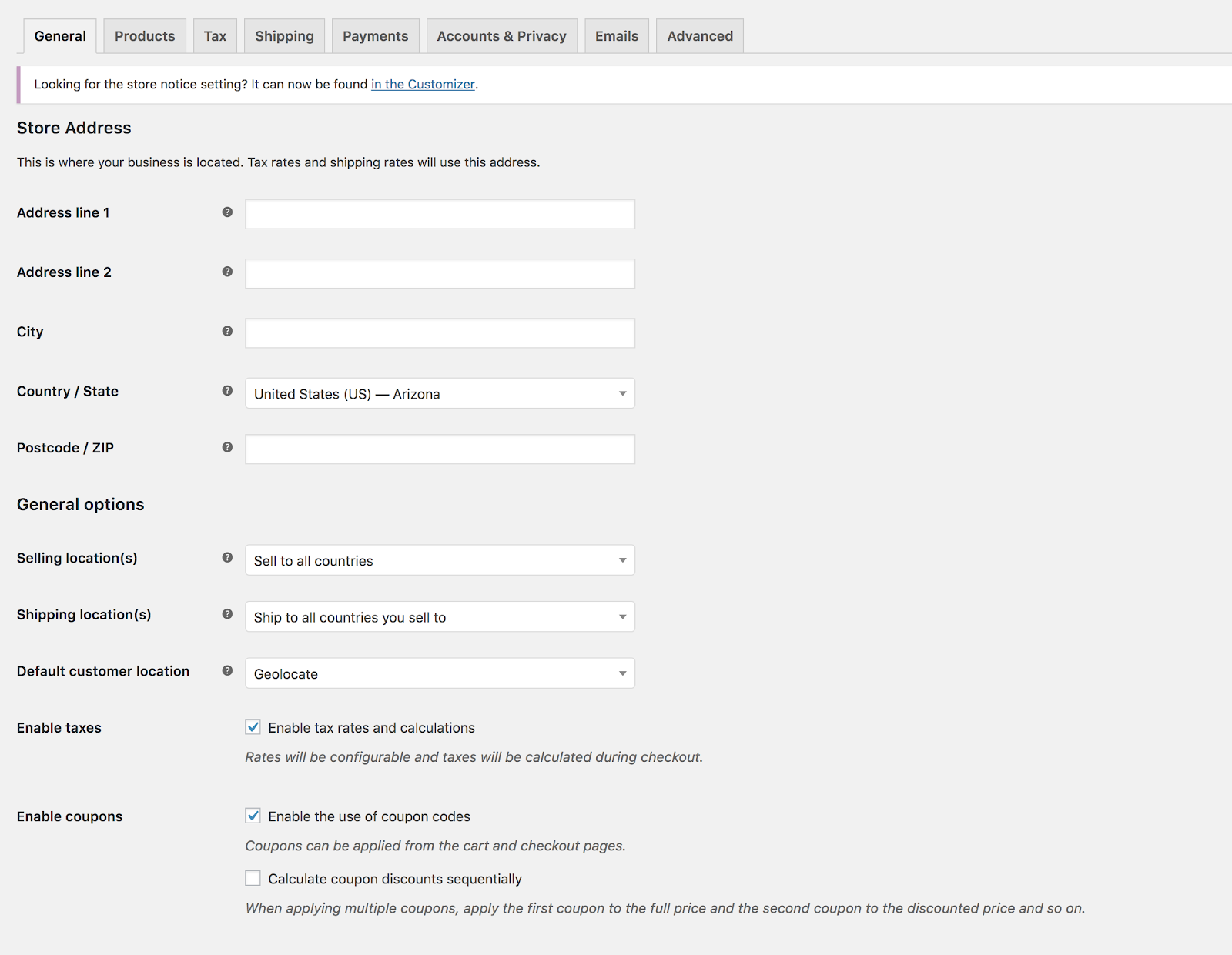
General Settings
Store address
Defines your shop’s address country and state, where you are based as a seller. It determines default tax rates and customer locations.
General options
Selling Location(s)
Choose to sell to all countries or to specific countries. You can choose multiple specific countries or states.
Shipping Location(s)
Choose to ship to only those countries you sell to or a subset of countries. You can disable shipping and all shipping-related functionality.
Default Customer Address
Choose the location we assume site visitors are in, before they enter it, to calculate tax and shipping.
- Shop base address tells the system to assume they are in the same location as your shop.
- No address gives them no location, so no taxes are calculated until they provide an address.
- Geolocate address verifies where their current location and calculate taxes accordingly.
- Geolocate with page caching support is the same as above, but does the geolocation via Ajax. You may notice your website URLs have a ?v=xxxxx appended to them. This is normal to prevent static caching of prices.
Enable Taxes
Enable or disable taxes on your store. Disabling taxes hides the tax settings page.
Enable coupons
Enable or disable coupons on your store. Coupons can be applied from the admin edit order screen (for unpaid orders), cart and checkout pages.
- Enable the use of coupon codes – Select to enable the use of coupons in your store.
- Calculate coupon discounts sequentially – Changes the coupon calculation logic to apply coupons in sequence on top of one another, rather than basing them on the original product prices.
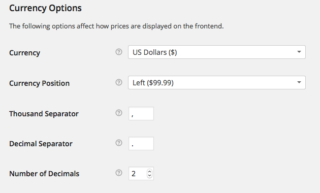
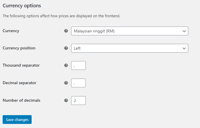
Currency options
Options that affect how prices are displayed on the frontend.
Currency
Choose the default currency for the store. Only one may be selected.
Currency Position
Choose the default currency position for prices: Left, Right, Left/Right with space
Thousand Separator
Choose the symbol to use for the thousand separator: 1,000 or 1.000
Decimal Separator
Choose the symbol to use for the decimal separator: 100.00 or 100,00
Number of Decimals
Choose how many numbers to display to the right of the decimal when displaying prices: 100.00 or 100
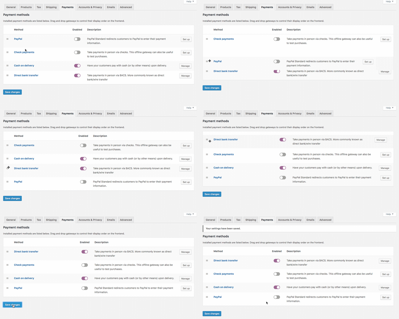
Go to: WooCommerce > Settings > Payments to control which payment gateways are enabled.
Payment gateways are listed and can be dragged and dropped to control the order in which they display to customers on the checkout.
Clicking the name of the payment gateway will take you directly to a screen to set up or adjust your settings.
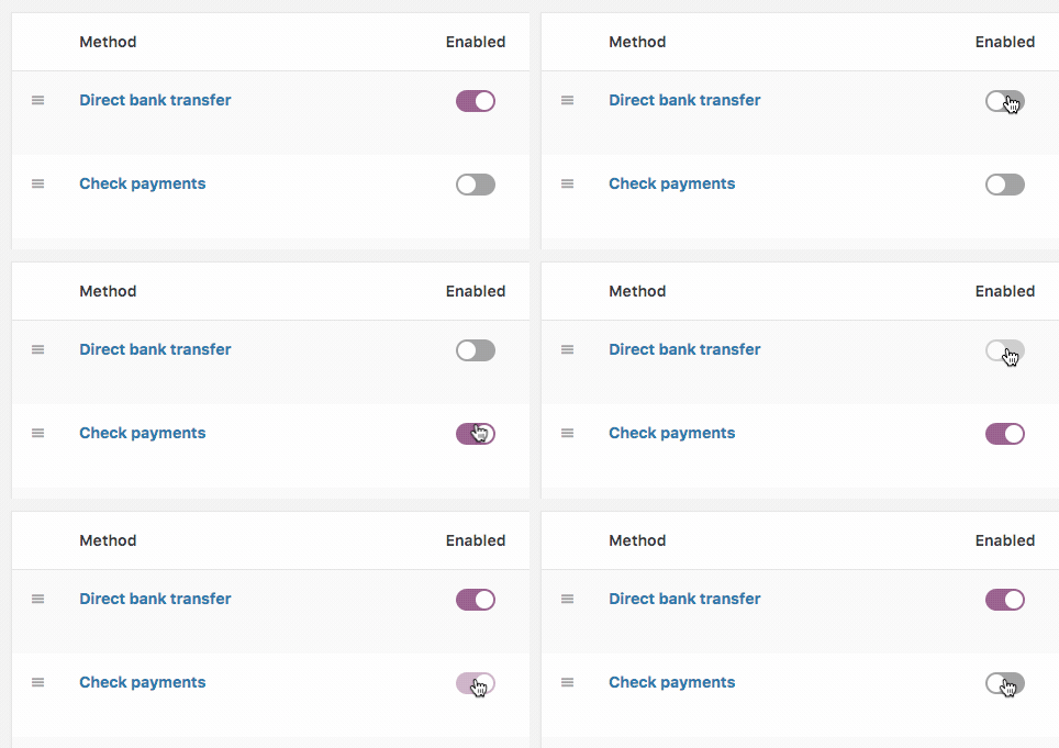
Another way to configure settings is to select Set Up or Manage. You can also use the Enabled toggle to turn a gateway on or off:
If you try to enable a payment method that needs extra configuration, it will redirect you to the payment methods setup screen.
Products Settings
Settings for products and how they are displayed, including image sizes, inventory and downloadable product settings.
General
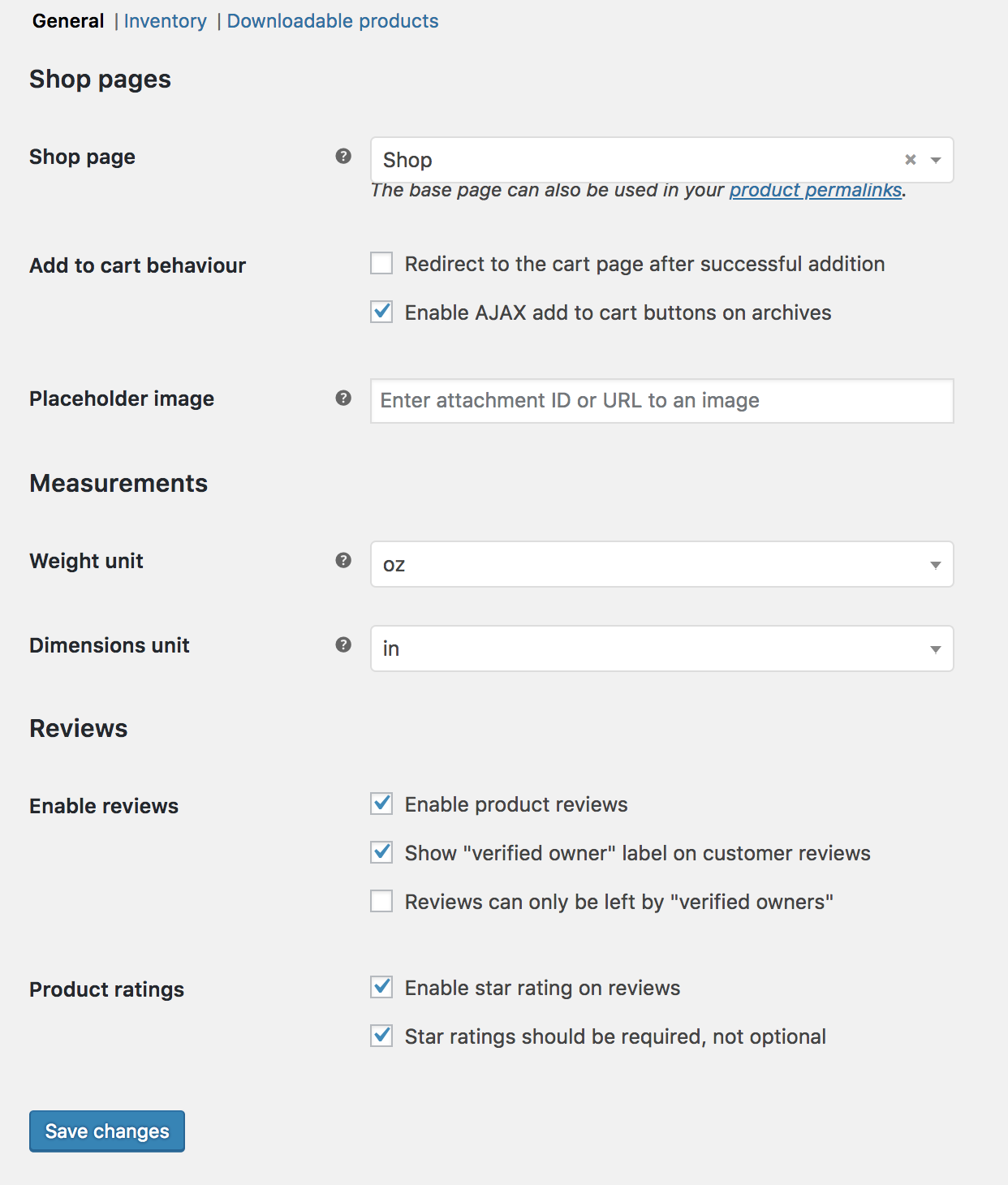
In the General section are Products Pages, Measurements and Reviews, allowing you to control checkout settings, select units of measurement, and enable/disable product reviews and ratings.
Go to: WooCommerce > Settings > Products > General:
Currency Option
Shop pages
Shop Page
Select what page you want to be the default shop page. Need not be the Shop page that WooCommerce installed, or can be skipped if you use another method to display products.
Add to cart behavior
- Redirect to cart page after successful addition – Automatically takes the customer to the cart page upon adding a product.
- Enable Ajax add to cart buttons on archives – Adds the ‘Add to Cart’ option to shop archive pages.
Placeholder Image
Set a default ‘placeholder’ image to appear on the front end when no other image is available. This could be your brand logo or an image of a signature product or service.
Measurements
Select a unit of measurement for weight and dimension of products from the dropdown.
Reviews
Enable Reviews
- Enable product reviews
- Select whether to display if the reviewer bought the product
- Control if anyone can leave a review or only buyers
Product Ratings
- Enable stars on reviews.
- Select whether it’s required or optional
Inventory Options
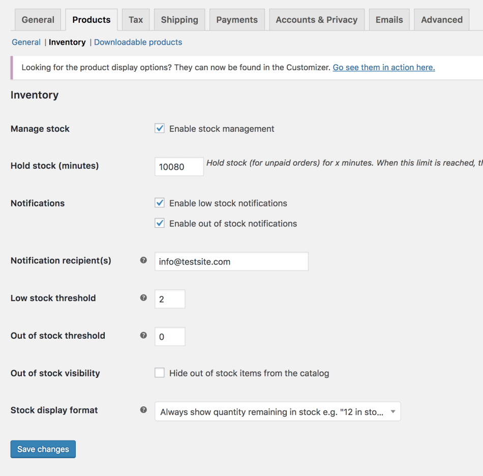
To edit your shop’s inventory options, go to: WooCommerce > Settings > Products > Inventory.
Choose whether to enable stock management. If selected, you have these options:
- Manage stock
- Enable stock management – Inventory for physical products is auto-managed. You enter quantity, and WooCommerce subtracts items as sales are made, displaying: Stock, Out of Stock or On Backorder. More info at: Stock Management Improvements.
- Disable (box left unticked) – Inventory and status for physical products must be entered manually. You can still Enable Stock Management on a per-product level if desired. More info at: Managing Products.
- Hold Stock (minutes) – Hold products (for unpaid orders) for X minutes. When limit is reached, the pending order is canceled. Leave blank to disable.
- Notifications
- Enable low stock notifications
- Enable out of stock notifications
- Notification Recipient – Enter email address for notifications.
- Low Stock Threshold – Number of products to trigger low stock notification
- Out Of Stock Threshold – Number of products to trigger out of stock status.
- Out Of Stock Visibility – Choose to hide out of stock items from catalog.
- Stock Display Format
- Always show stock – “12 in stock”
- Only show stock when low – “Only 2 left in stock” vs. “In stock”
- Never show amount
Downloadable Products
Go to: WooCommerce > Settings > Products > Downloadable products.
File Download Method
Controls how your store provides downloadable files to purchasers.
- Force Downloads – Files are ‘forced’ to download via a PHP script. Files are not accessible to anyone but purchasers, and direct links are hidden.
- X-Accel-Redirect/X-Sendfile – Similar to ‘forced’ above, but it has better performance and can support larger files. It requires that your hosting provider supports either X-Sendfile or X-Accel-Redirect, so you need to check with them first.
- Redirect only – A download URL links the user to the file. Files are not protected from outside access.
Most stores should use one of first two methods to keep files safe from outside access. Redirect should only be used if you encounter problems or don’t mind downloads being non-secure.
Access Restriction
- Select if downloads require login – Does not apply to guest purchases.
- Grant access to downloadable products after payment – Enable to grant access to downloads when orders are Processing, rather than Completed.
Go to: WooCommerce > Settings > Shipping.
The main shipping settings screen is for Shipping Zones. Think of a shipping zone as a geographic region where a certain set of shipping methods and their rates apply.
You can read about setting up shipping zones at: Setting up Shipping Zones
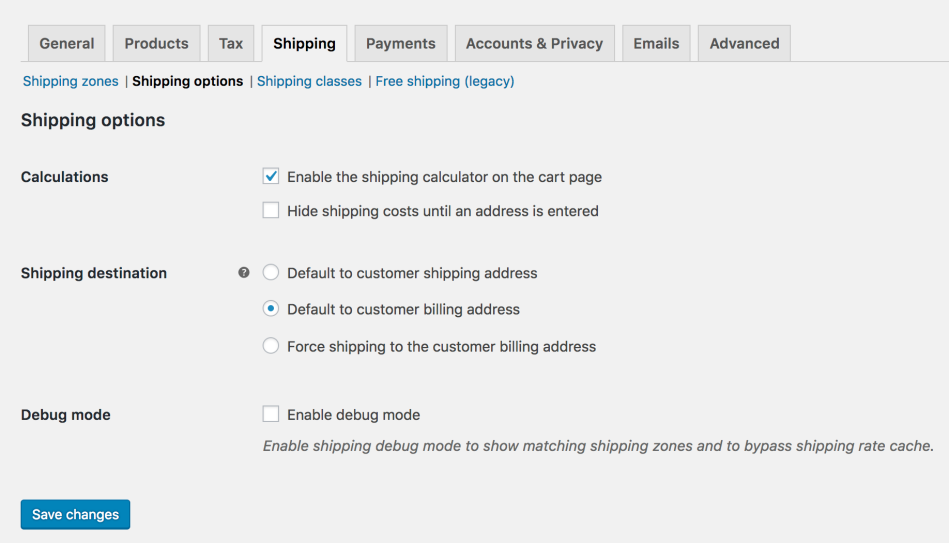
Shipping Options
Shipping Calculations
- Enable the shipping calculator on the cart page
- Hide shipping costs until an address is entered
Shipping Destination
Ship to billing address or customer shipping address by default or only ship to the user’s billing address.
Debug Mode
Enable for troubleshooting purposes.
Go to WooCommerce > Settings > Accounts and Privacy to control options relating to customer accounts and data retention.
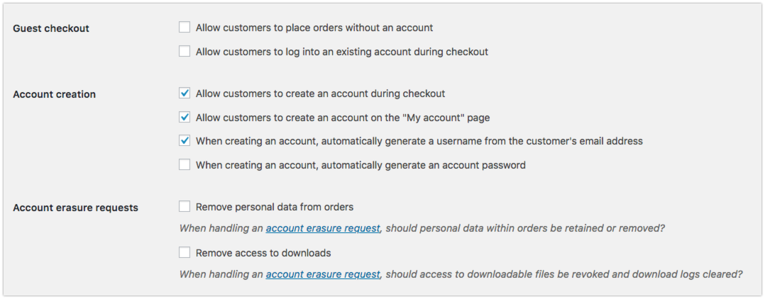
Guest Checkout
- Allow customers to place orders without an account – Allows customers to check out without creating an account. Orders will not be tied to a user account in WordPress.
- Allow customers to log into an existing account during checkout – This displays a login form and prompt on the checkout page if the customer is not already logged in.
Account Creation
- Allow customers to create an account during checkout
- Allow customers to create an account on the My account page
- Automatically generate username from customer email – If this is disabled, there will be an input box for the user to create their own username.
- Automatically generate customer password – If this is disabled, there will be an input box for the user to create their own password. Note that while the password strength notification will be displayed, customers can choose any password so as to not limit conversions.
Account erasure requests
- Remove personal data from orders – WordPress 4.9 allows you to remove personal data on request. When doing this, if you enable this option, user data will also be removed from your orders if they belong to the user being erased.
- Remove access to downloads – WordPress 4.9 allows you to remove personal data on request. When doing this, if you enable this option, download data will also be removed if it belongs to the user being erased. The erased user will no longer have access to any purchased downloads if this happens.
Personal data removal
- Allow personal data to be removed in bulk from orders – Adds a new bulk action to remove personal data on the Orders page. Useful if you need to manually anonymize orders in bulk.
Privacy policy
This section lets you select a page for your privacy policy, and display privacy policy snippets on your account and checkout pages shown to customers. These settings were added in WooCommerce 3.4.
- Privacy Page – Select a page to act as your privacy policy. Using [privacy_policy] will link to this page. Some themes also use this option to link to a privacy policy in other places, such as the footer. This feature was added in WordPress 4.9.
- Registration privacy policy – Shown on the registration form on the My Account page. You should include information about your privacy policy, and link to your page privacy policy page for more information.
- Checkout privacy policy – Shown on the checkout form. You should include information about your privacy policy, and link to your page privacy policy page for more information.
Options available to edit email settings and templates.
Go to: WooCommerce > Settings > Emails.
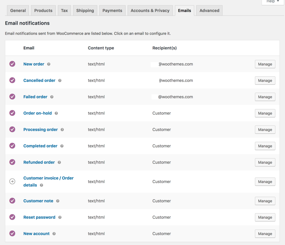
Email notifications
For each WooCommerce email listed, it’s possible to configure your settings (optional). More detailed instructions below in: Editing Individual Email Templates.
Email Sender Options
Set the ‘From’ name and email address for the sender.
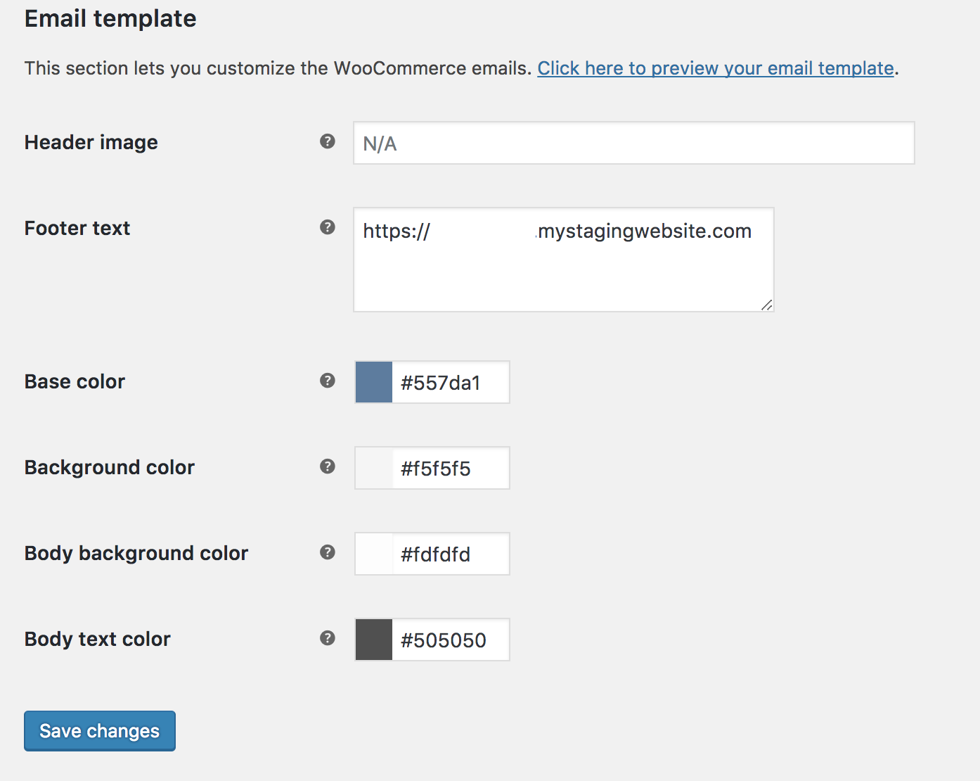
Email Templates
This section lets you customize WooCommerce emails.
Header Image
Enter the URL of an image you want to show in the email header. You can upload an image via the Add Media button or Media > Add New.
Email and Text
- Base Color – Color for WooCommerce email templates.
- Background Color – Background color for WooCommerce email templates.
- Email Body Background Color – Main body background color.
- Email Body Text Color – Main body text color.
Editing Individual Email Templates
In the list above in Email Notifications are these templates:
New order | Cancelled order | Failed order | Processing order | Completed order | Refunded order | Customer invoice | Customer note | Reset password | New account
Select Manage on the right side, and a new screen appears.
New order
Select options or enter preferences:
Enable/Disable
Enable this email notification.
Recipient(s)
Enter recipients (comma separated) for this email. Defaults to info@woocommerce.com.
Subject
This controls the email subject line. Leave blank to use the default subject:
[{site_title}] New customer order ({order_number}) - {order_date}
Email Heading
This controls the main heading contained within the email notification. Leave blank to use the default heading.
Email type
Choose which format of email to send. Options include:
- Plain Text
- HTML
- Multipart
If using Plain Text emails, keep in mind that text fields are limited to 155 characters. If your products have long names and/or numerous variations/add-ons, the field may be truncated.
——————————————————–
*We not suggest to edit this part unless you really need to custom-made your own email notification content, by default Woocommerce templates is great to use.
HTML template
To override and edit this email template, copy
woocommerce/templates/emails/
admin-new-order.php to your theme folder:
yourchildtheme/woocommerce/
emails/admin-new-order.php. You can also copy the template file or view it on this setting screen.
Save any changes.
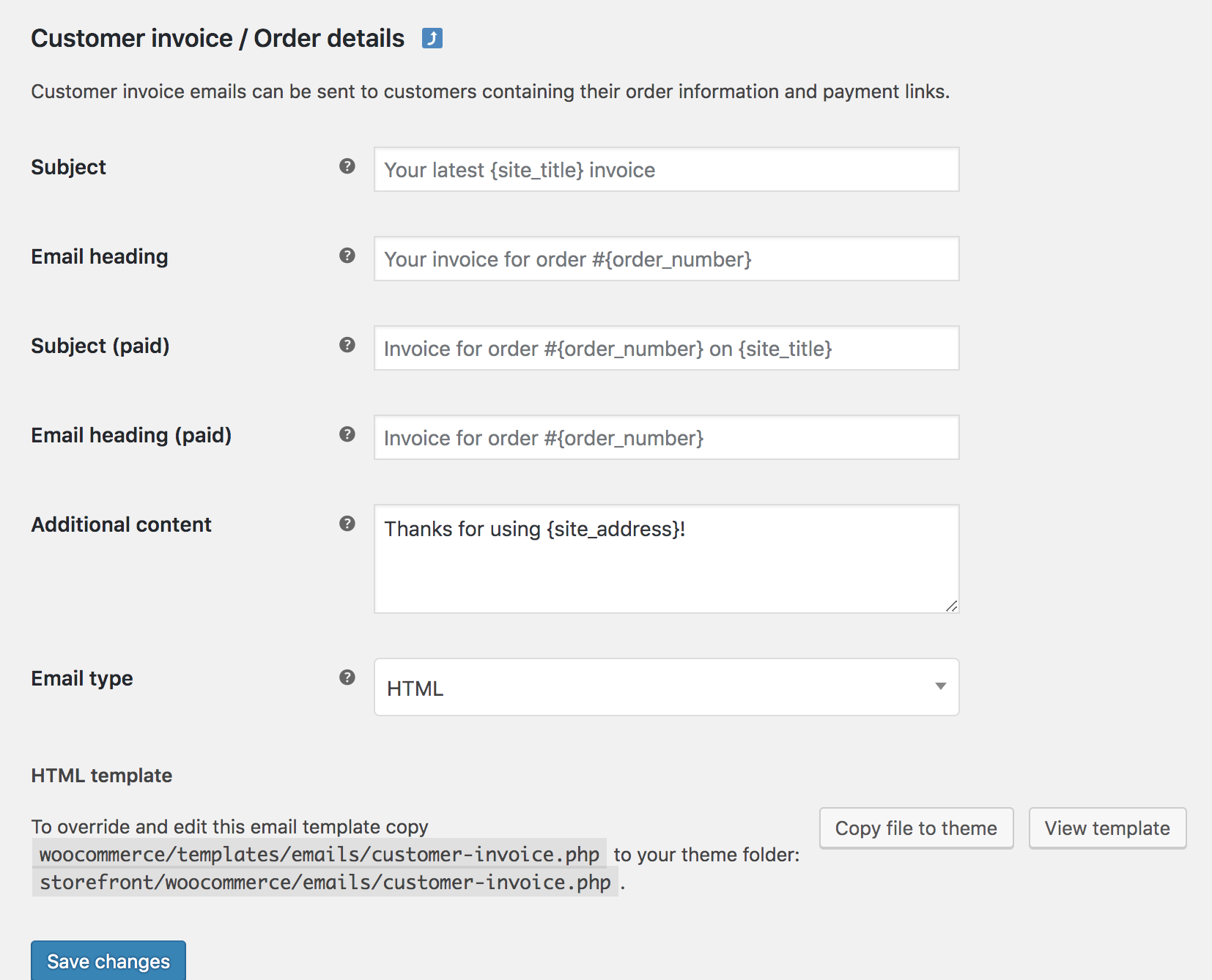
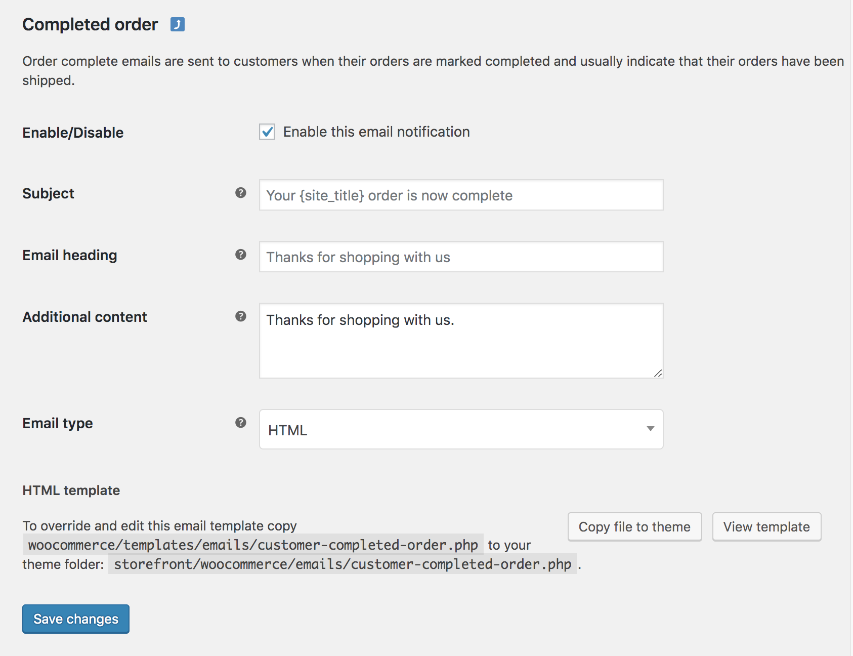
Completed order and Customer invoice / order details
The Completed order and Customer invoice/ Order details templates have slightly different settings from others.
- Customer invoice/Order details cannot (and should not) be disabled.
- Both templates have ‘Thanks’ fields that can be altered.
Step 2: Upload your products & manage your orders
Upload your products & Manage your orders
Adding a simple product
Adding a Simple product is similar to writing a post in WordPress.
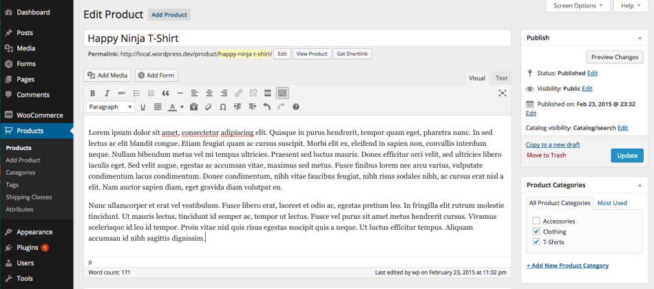
- Go to WooCommerce > Products > Add Product. You then have a familiar interface and should immediately feel at home.
- Enter a product Title and Description.
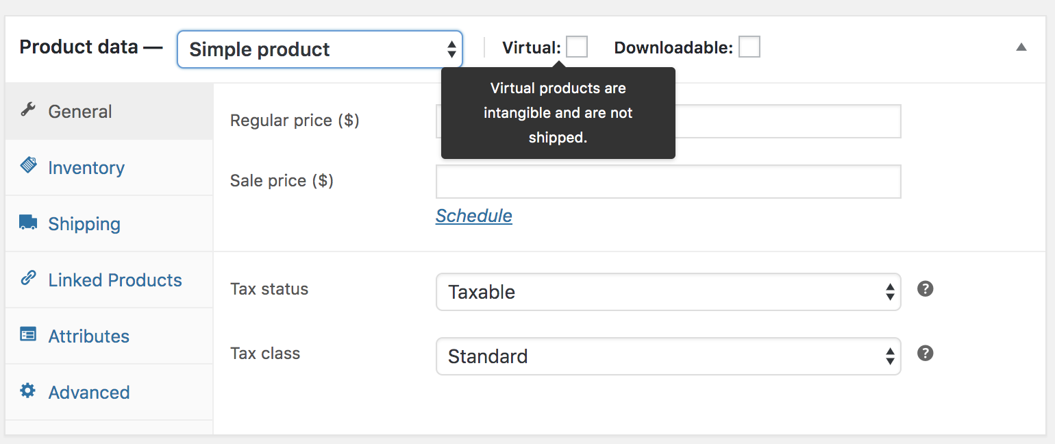
- Go to the Product Data panel, and select downloadable (digital) or virtual (service) if applicable.
Note: Virtual products don’t require shipping — an order with virtual products won’t calculate shipping costs.
Product data
The Product Data meta box is where the majority of important data is added for your products.
General section
- Price
- Regular Price – Item’s normal/regular price
- Sale Price – Item’s discounted price that can then be scheduled for certain date ranges. The sale expires at 11:59pm of the specified end date
- Tax
- Tax status – Taxable / Shipping only / None
- Tax class – Choose which tax class should be applied
Inventory section
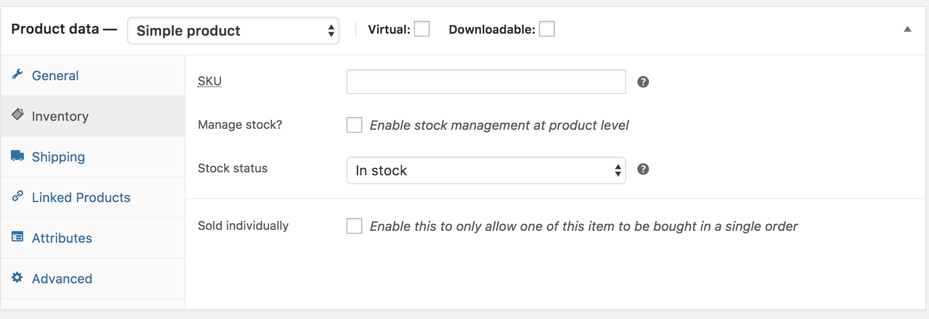
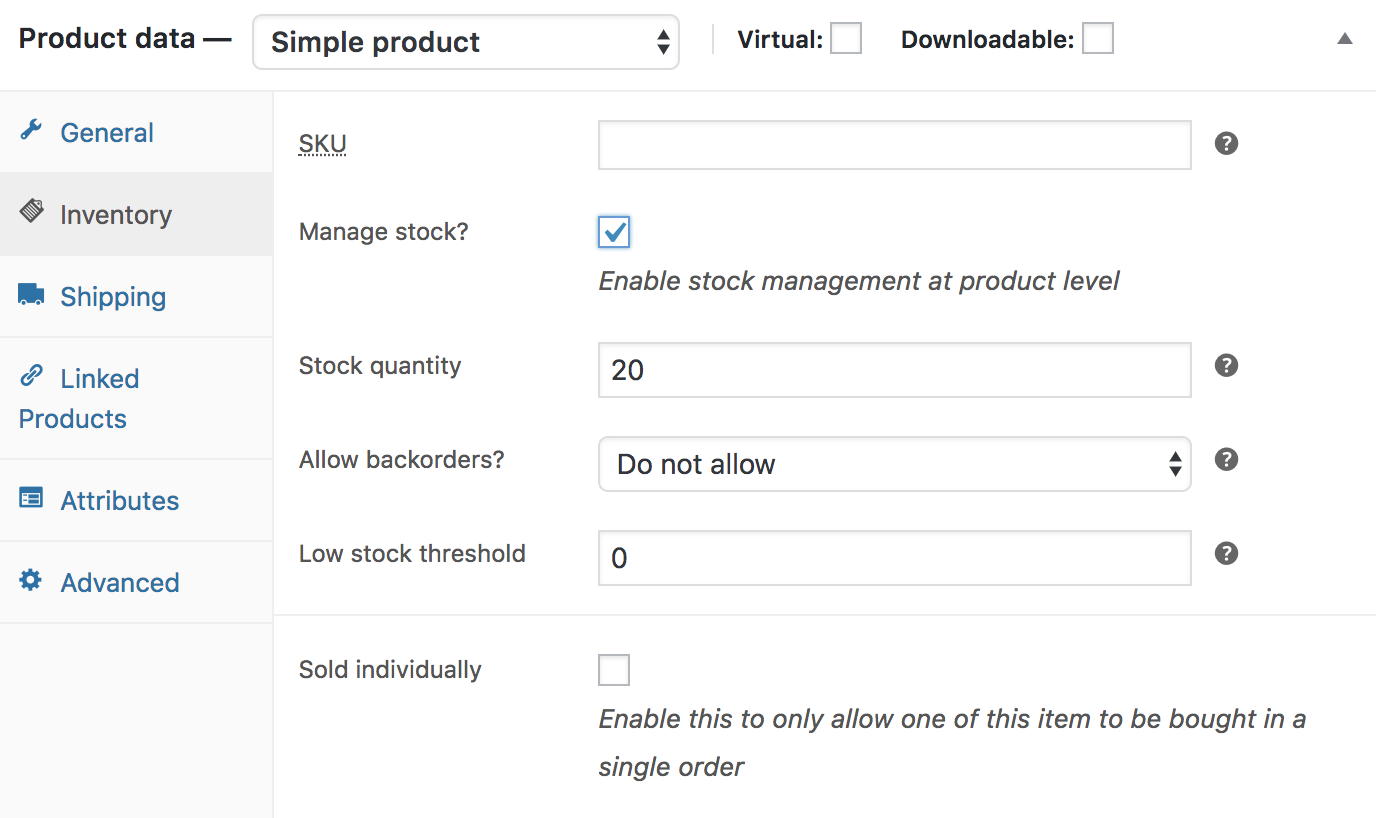
The inventory section allows you to manage stock for the product individually and define whether to allow back orders and more. It enables you to sell products and allow customers to add them to the cart to buy.
Enable Stock Management must be selected in Products Inventory Settings; otherwise, only the ‘Stock status’ option is visible in the Product Data Inventory box.
Options when stock management at product level is disabled. You are responsible for updating the Stock Status.
Options when stock management at product level is enabled.
- Enter the Stock Quantity, and WooCommerce auto-manages inventory and auto-updates Stock Status as Stock, Out of Stock or On Backorder.
- Select whether to Allow Backorders.
- Low stock threshold – Enter a number upon which you are notified.
- Tick the Sold Individually box to limit the product to one per order.
Shipping section
- Weight – Weight of the item.
- Dimensions – Length, width and height for the item.
- Shipping Class – Shipping classes are used by certain shipping methods to group similar products.
Linked Products section
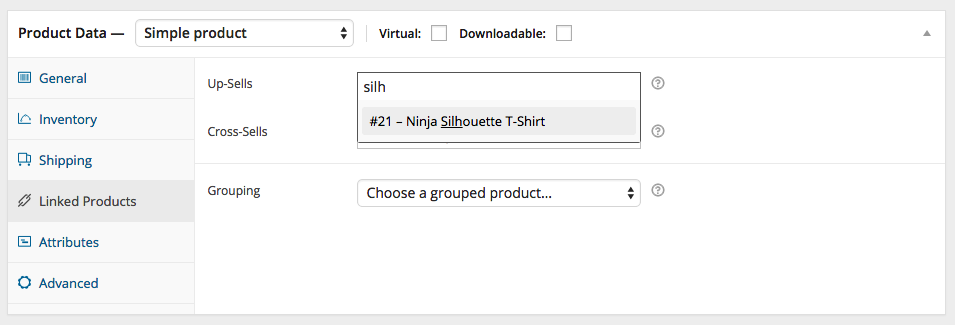
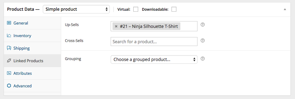
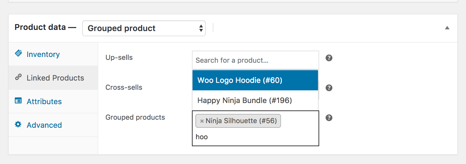
Using up-sells and cross-sells, you can cross promote your products. They can be added by searching for a particular product and selecting the product from the dropdown list:
After adding, they are listed in the input field:
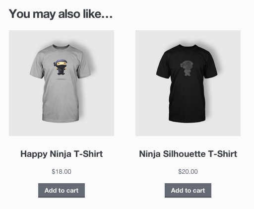
Up-sells are displayed on the product details page. These are products that you may wish to encourage users to upgrade, based on the product they are currently viewing. For example, if the user is viewing the coffee product listing page, you may want to display tea kettles on that same page as an up-sell.
Cross-sells are products that are displayed with the cart and related to the user’s cart contents. As an example, if the user adds a Nintendo DS to their cart, you may want to suggest they purchase a spare stylus when they arrive at the cart page.
Grouping – Used to make a product part of a grouped product. More info below at: Grouped Products.
Attributes section
On the Attributes tab, you can assign details to a product. You will see a select box containing global attribute sets you created (e.g., platform). More at: Managing Product Categories, Tags and Attributes.
Once you have chosen an attribute from the select box, click add and apply the terms attached to that attribute (e.g., Nintendo DS) to the product. You can hide the attribute on the frontend by leaving the Visible checkbox unticked.
Custom attributes can also be applied by choosing Custom product attribute from the select box. These are added at the product level and won’t be available in layered navigation or other products.
Advanced section
- Purchase note – Enter an optional note to send the customer after they purchase the product.
- Menu order – Custom ordering position for this item.
- Enable Reviews – Enable/Disable customer reviews for this item.
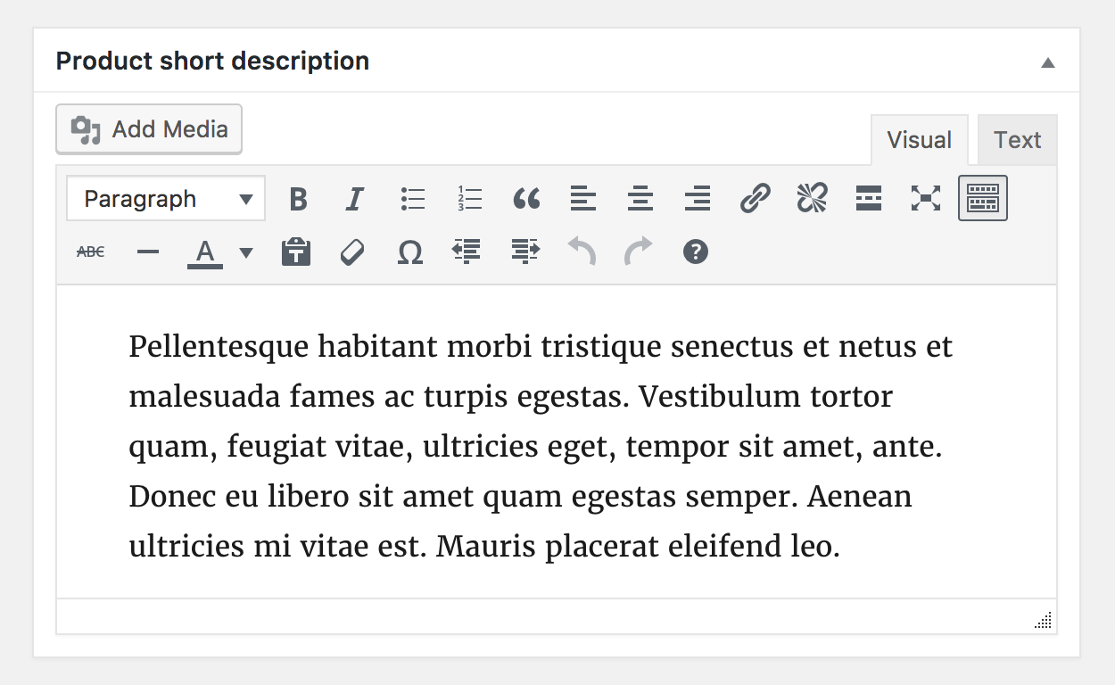
Product short description
Add an excerpt. This typically appears next to product imagery on the listing page, and the long description appears in the Product Description tab.
Video embeds (oembed) may be used, as of version 3.1x.
Taxonomies
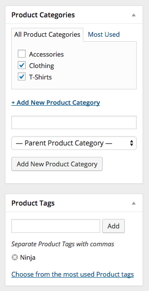
On the right-hand side of the Add New Product panel, there are product categories in which you can place your product, similar to a standard WordPress post. You can also assign product tags in the same way.
Product images
Add a main product image and a gallery of images. More at: Adding Product Images and Galleries.
Setting catalog visibility options and feature status
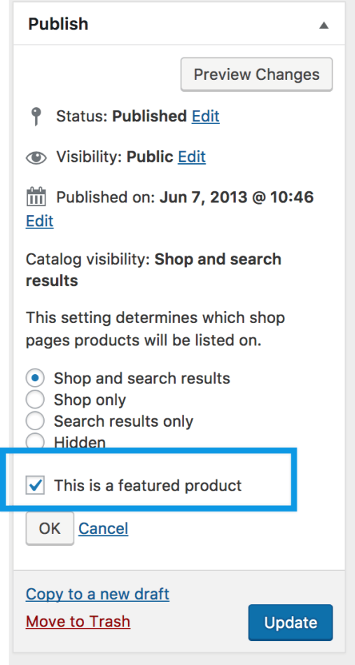
In the Publish panel, you can set Catalog Visibility for your product.
- Shop and search – Visible everywhere, shop pages, category pages and search results.
- Shop only – Visible in shop pages and category pages, but not search results.
- Search only – Visible in search results, but not in the shop page or category pages.
- Hidden – Only visible on the single product page – not on any other pages.
You can also set whether the product is promoted in product categories, up-sells, related products as a Featured Product. For example, you could tick the Featured box on all bundles you sell.
Other ways to set as Featured are described in the below section: Mark a product as Featured.
Adding a grouped product
A grouped product is created in much the same way as a Simple product. The only difference is you select Grouped from the Product Type dropdown.

Create the Grouped product
- Go to: WooCommerce > Products > Add New.
- Enter a Title for the Grouped product, e.g., Back to School set
- Scroll down to Product Data and select Grouped from the dropdown. The price and several other fields disappear. This is normal because a Grouped Product is a collection of ‘child products’, which is where you add this information.
- Publish.
The Grouped product is still an empty group. To this Grouped product, you need to:
- Create products and add them
- Add existing child products
Having the choice to first create Simple products and add them to a Grouped product later; or first create a Grouped product and add Simple products later gives you flexibility to add Simple products to more than one Grouped product.
Add products to the Group
- Go to: WooCommerce > Products > Add New.
- Select the Grouped product you wish to add products to.
- Scroll down to Product Data and go to Linked Products.
- Select Grouped Products, and search for the product by typing
- Click the products you wish to add.
- Update
- You can drag and drop to reorder the Grouped Products. Once you press Update, the new order will be shown on the product page.
Adding a virtual product
When adding a Simple product, you can tick the Virtual checkbox box in the product type panel.
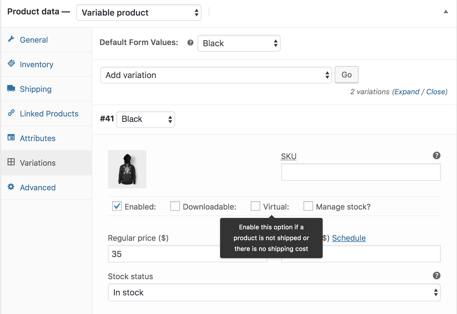
With Variable products this checkbox is moved to each variation.
Enabling this, disables all shipping related fields such as shipping dimensions. A virtual product will also not trigger the shipping calculator in cart and checkout.
Adding a downloadable product
When adding a simple product, you can tick the Downloadable checkbox box in the product type panel. This adds two new fields:
- File path — Path or url to your downloadable file.
- Download limit – Limit on number of times the customer can download file. Left blank for unlimited downloads.
Managing Orders
Orders are created when a customer completes the checkout process, and they are visible to users with Admin and Shop Manager roles only. Each order is given a unique Order ID.
Order Statuses
An order also has a Status. Order statuses let you know how far along the order is, starting with “Pending payment” and ending with “Completed.” The following order statuses are used:
- Pending payment — Order received, no payment initiated. Awaiting payment (unpaid).
- Failed — Payment failed or was declined (unpaid) or requires authentication (SCA). Note that this status may not show immediately and instead show as Pending until verified (e.g., PayPal).
- Processing — Payment received (paid) and stock has been reduced; order is awaiting fulfillment. All product orders require processing, except those that only contain products which are both Virtual and Downloadable.
- Completed — Order fulfilled and complete – requires no further action.
- On hold — Awaiting payment – stock is reduced, but you need to confirm payment.
- Canceled — Canceled by an admin or the customer – stock is increased, no further action required.
- Refunded — Refunded by an admin – no further action required.
- Authentication required — Awaiting action by the customer to authenticate the transaction and/or complete SCA requirements.
Visual Diagram to Illustrate Order Statuses
This visual representation follows an order through its statuses from “Pending payment” to “Completed”, “Canceled” or “Refunded.”
Viewing and Managing Multiple Orders
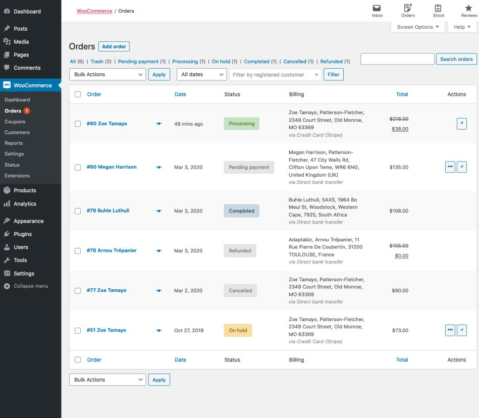
Orders Overview
When a shop starts taking orders, the Orders management page begins to fill up. Go to: WooCommerce > Orders.
Each row displays several details. Some are there by default, others can be added. These are the available options:
- Order number and customer name,
- Date of purchase,
- Order status,
- Billing address,
- Shipping address,
- Purchase total, and
- Actions.
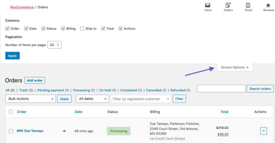
To change these columns:
- Go to: WooCommerce > Orders.
- Select Screen Options in the top right corner.
- Select which Columns to show.
- Select how many Items you want to be displayed on each page.
- Then Apply.
Filter and Arrange Orders
Filter orders by Date (month/year) or by registered customer.
- Select the month, or search for a customer.
- Select Filter.
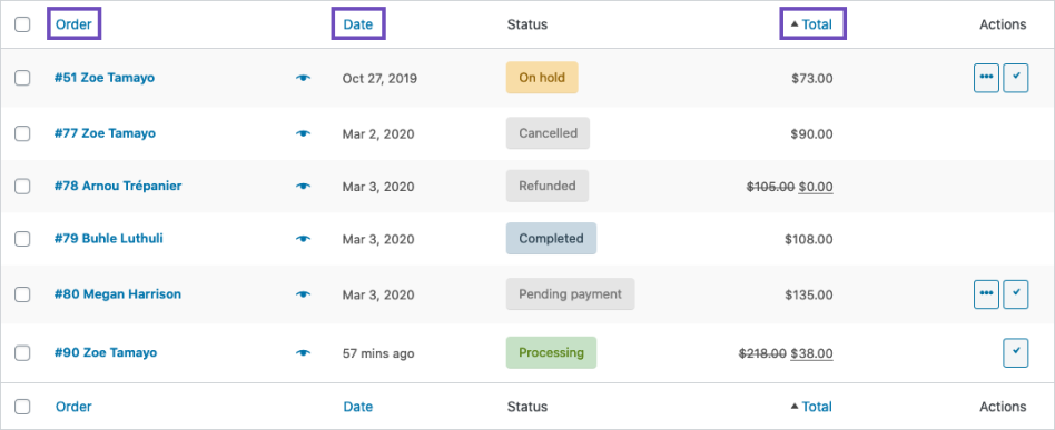
Arrange orders in ascending or descending order by Order number, Date or Total by select the heading.
Note that the “Total” column does not take the refunded amount into consideration.
Click the order number and customer name to see the Single Order page, where you can also Edit order details, Update Status, and Add Notes. More details on that in Viewing and Editing Single Orders.
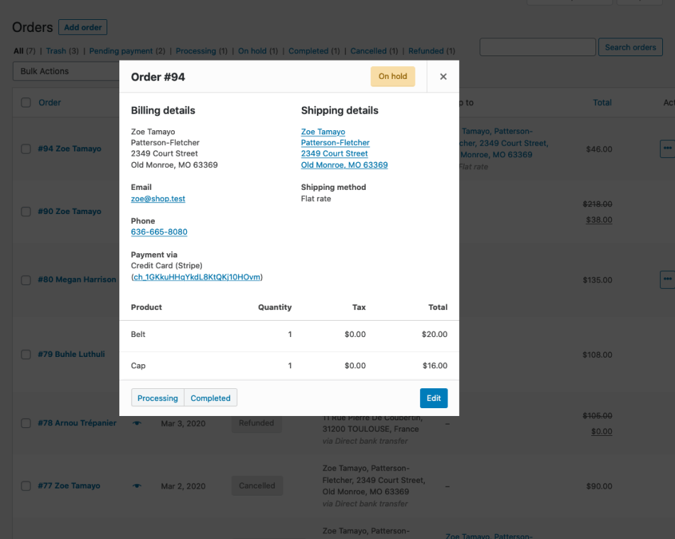
Previewing Orders
Order rows have a Preview “eye.”
Clicking Preview opens a Modal, containing the order number, order status, billing details, payment method, shipping details, shipping method, items ordered, and the option to change the order status.
Order Statuses in the Overview
Order Statuses are color-coded and descriptive.
- Canceled – Grey
- Completed – Blue
- Failed – Red
- On Hold – Orange
- Pending Payment – Grey
- Processing – Green
- Refunded – Grey
Order Actions
Hovering over an order Status displays Notes made on the order.
At the end of a row are shortcut buttons to quickly mark orders as Processing or Complete.
Viewing and Editing a Single Order
From the Single Order page not only can you view all order data, but also edit and update.
- Change the order status.
- Edit order items – modify the product, prices, and taxes.
- Stock – Reduce and restore stock for an order
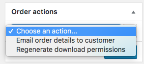
- Order Actions – Email order details to customer (handy if manually creating an order for your customers) or Regenerate download permissions
- Modify product Meta to edit product variations by removing and adding meta
- Apply coupons. You will need to know the coupon code to apply to the order. Coupon usage counts are tracked, and coupons can also be removed from orders. Note: the order must be unpaid for coupons to have an affect
- Add fee. You can enter an amount or percentage to add a fee to an order. Negative fees will apportion taxes between all other items, and will not make the cart total go below zero
Order Details
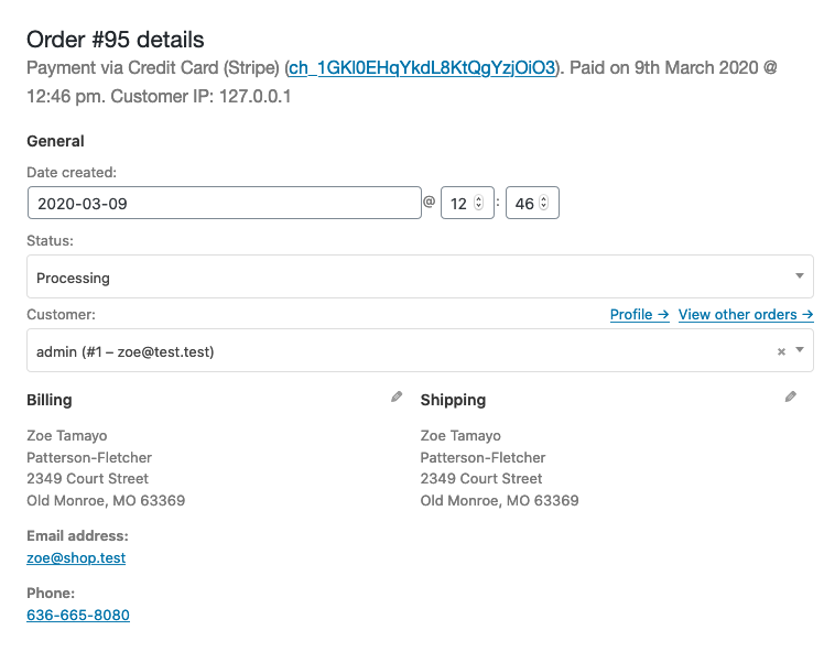
Viewing Order Details
The Order Details panel you can view:
- Order number
- Payment details
- Order date and time
- Order status
- Customer details:
- Username and email, together with a link to view their profile and other purchases the customer may have had in the past
- Billing details
- Shipping details
Editing Order Details
Most of the details in this section can be updated and/or changes.
- To change the date and time, use the dropdown date selector and the quantity selectors for the time.
- To change the status, choose the right status in the dropdown.
- To change the customer, select the current customer and search for the new customer.
Under “Billing” and “Shipping”, several other details can be changed. In order to do so, select the pencil icon next to each of them.
- Under “Billing”, the following things can be changed:
- Billing address — this can also be loaded from the customer’s profile by selecting “Load billing address”
- Phone number
- Payment method and details
- Under “Shipping”, the following things can be changed:
- Shipping address — this can also be loaded from the customer’s profile or copied from the billing address
- Customer provided note
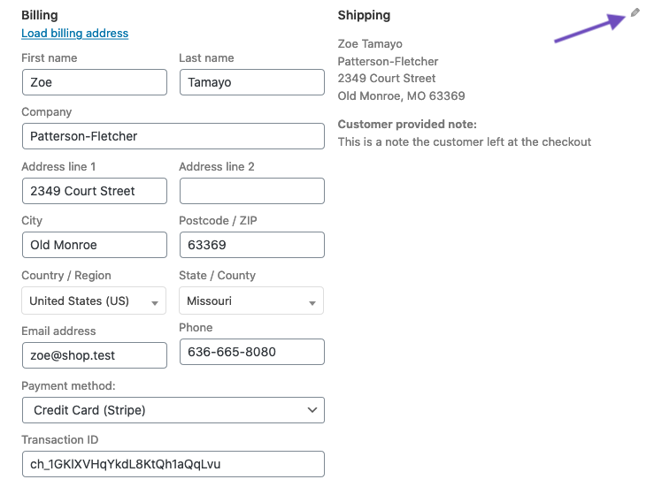
Once you’ve made the necessary changes, select Update to update the order.
Order Items and Totals
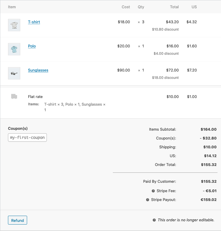
Viewing Order Items
The next panel on the order page is the Order Items panel. This contains the product items, the shipping details, and the order summary.
- Each product item row lists:
- Product image
- Product name
- Single product Cost
- Quantity
- Total (Cost x Quantity, with discounts taken into consideration)
- Taxes
- Below that, the shipping details are displayed. This will include:
- Shipping method
- Boxed items
- Total cost
- Taxes
- The last section contains an overview of the order costs. This section will change if an order is refunded. By default, it will include:
- Items subtotal — cost excluding tax
- Coupon(s) — amount deducted based on the use of coupons; the coupons used are displayed left in this section
- Shipping — the shipping cost for the order
- Taxes — the amount of taxes for the whole order; this will be replaced by the tax code applied to the order
- Order total — the total of the above costs
- Finally, below the line, an overview of what is paid and the fees taken by payment gateways
Editing or Adding Order Items
Apart from refunding, order items can not be edited, unless the order status is “Pending payment”, or “On hold.”
Product items. Select the pencil icon next to a product line to edit.

The following product items can be edited:
- Add Meta — Add and remove meta to change product variable options.
- Quantity — Number of items the customer is purchasing.
- Total — Line price and line tax before pre-tax discounts.
- Tax — Tax cost. For example, if a customer is tax-exempt you may want to remove the taxes.
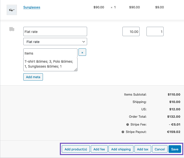
Other actions. Next, you can do four actions at the bottom of this window:

- Add item(s) — this will show you six new options:
- Add product(s) — Add additional products to the order.
- Add fee — Add an additional fee, such as gift wrapping.
- Add shipping — Add a shipping cost. When you’ve done this, select the pencil icon to update the name, the method, the cost, and the tax.
- Add tax — Add an additional tax code to every section in the order.
- Cancel — Cancel if you do not want to make any changes.
- Save — Save once the changes are made.
- Once you’ve done this, select Recalculate to make sure all the changes are reflected in the order totals.
- Apply coupon — If your customer forgot to add the coupon could or you want to reward the customer before they pay, selecting this option will show a modal that allows you to apply a coupon code.
- Refund — to refund the customer. For more information about Manual and Automatic Refunds, see WooCommerce Refunds.
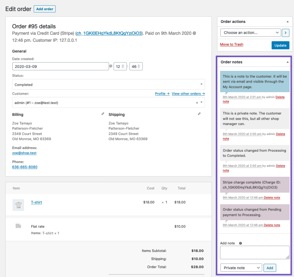
Order Notes
The Order Notes panel displays notes attached to the order and can be used for storing event details, such as payment results or reducing stock levels, or adding notes to the order for customers to view. Some payment gateways also add notes for debugging.
The following note types are possible:
- Purple: System status notices, such as payment gateway details.
- Grey: General status updates, such as status changes or private notes. Customers do not see these notes but may receive notification of them, e.g., when the status changes from processing to completed, an email may be sent (depending on your settings).
- Blue: Notes to the customer. Customers receive notes via email but can view them by viewing an order, or using the WooCommerce order tracking page.
Notes can be a powerful tool for communicating with customers or other store managers. Need to add a tracking number for shipping? Is stock delayed? Add a customer note, and they are automatically notified.
To add a note,
- Use the textarea to add the content of the note.
- Select Private note or Note to customer in the dropdown.
- Select Add.
Manually Adding an Order
To add an order:
- Go to: WooCommerce > Orders.
- Use Add New at the top of the page. The Single Order page appears.
- Input customer details, add line items, apply coupons, apply fees and calculate totals. These are the same as the Editing or Adding Order Items.
- Set a status for the new order, e.g., If it needs to be paid, use “Pending payment.”
- Save.
Use the Order Actions dropdown to Email order details to the customer with payment instructions.
Paying for an Order
Orders that are “Pending payment” can be paid for through the payment link.
As the Webadmin, you can find this link on the order overview:
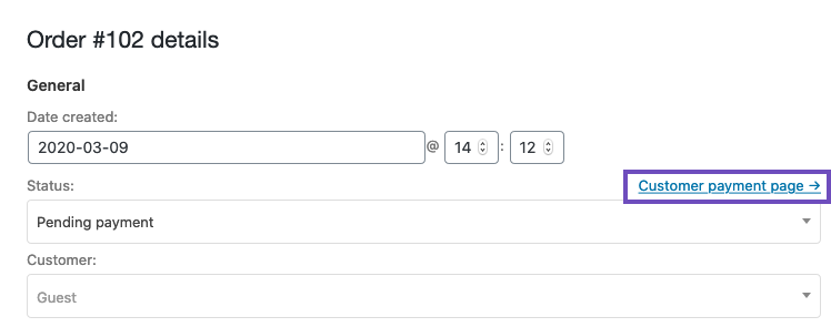
- If the customer is a Guest, anyone with the right link will be able to view the payment page and pay for the order.
- If the customer is registered on your site,
- Only this customer will be able to see the payment link once they are logged in.
- The customer can also find the order in: My Account > Orders.
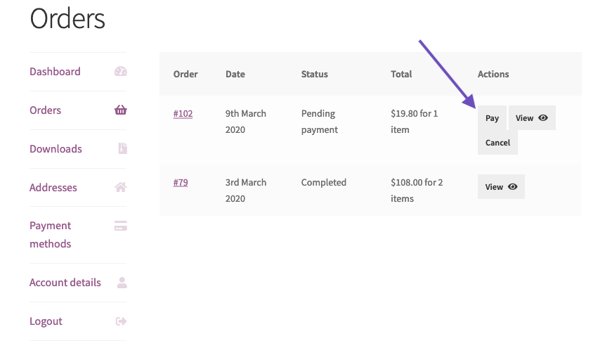
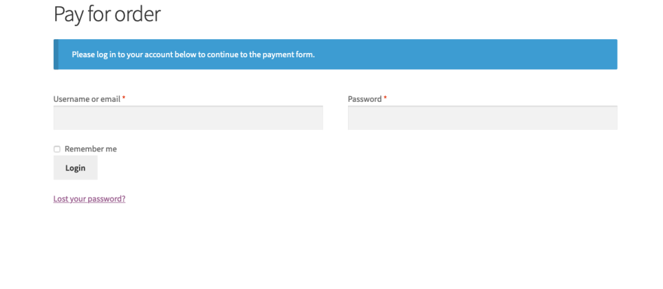
If the customer is assigned to the order, they will be asked to log in before paying:
Step 3: Edit website content / create new content or webpages
WOA-PRO user can only edit content such as changing a text or sentences, changing banner images, images but can’t create new contents or new pages.
WOA-MASTER / WOA-MAX users can create new content, new webpages, new forms with ready templates or custom it.
Edit Website Content / Create new content or webpages.
Elementor Panels Overview

Text Editor Widget
The Text Editor widget is a TinyMCE WYSIWYG editor that behaves just like the classic WordPress visual editor. You can enter rich text, images and even WordPress shortcodes. In addition to the features that normally appear on the TinyMCE editor, this widget also gives you more styling options that let you change settings like font weight, line height, letter spacing, alignment and more.Quick Video:
Content
Style
Text Editor
- Alignment: Align the text to the left, right, center, or justified
- Text Color: Choose the color of the text
- Typography: Set the typography options for the text
- Columns: Select the number of columns to split the text into
- Column Gap: Set the width of the gap between columns
Drop Cap
- View: Select the view style of the drop cap, choosing from Default, Stacked, or Framed
- Primary Color: Choose the color of the drop cap
- Space: Select the exact space between the drop cap and the rest of the text
- Border Radius: If Stacked or Framed is chosen as the View, set the border radius to control corner roundness
- Typography: Set the typography options for the drop cap
How to Wrap Text Around Images With the Text Editor Widget
Users sometimes ask how to wrap text around images in Elementor. This is an excellent use of the Text Editor widget. Simply drag-in the widget, click Add Media and upload an image of your choosing to the media library of WordPress. Then click the image, and adjust the alignment settings to wrap the text around the image, with the image to the right or left of the text.Is The Text Editor Widget Missing The Visual and Text tabs?
 The Text Editor widget respects the user’s choice in WordPress settings to enable or disable the Visual Tab. If your tabs are missing, please go to the WordPress Dashboard > Users > Your Profile and uncheck the option to disable the Visual Editor.
Take note: WOA-PRO can only edit the content.
Form Fields
Form Name – Name the form.
Form Fields – A list of the fields in your form. You can duplicate, add or delete fields as you please. You can drag and drop to change their order.
Click on a field to view its settings.
- Type – Choose the type of field you want (A list of types here)
- Label – The name of the field, displayed on the form and on the email you receive from the user.
- Placeholder – The frontend display name of the field.
- Required – Switch it on to set the field as a Required field.
- Column Width – Lets you set the width of the field. If you want a form with two fields in one row – set each field to 50%.
Types of Fields
- Text – A simple text field. i.e. Name
- Email – An email type. Includes validation for email
- Text Area – A textarea type. You can set the number of rows
- URL – A website URL field
- Tel – A telephone number type
- Radio – A radio type. Single choice. You can slide the Inline List for a horizontal style. Click for more options
- Select – A select type. Dropdown list of options. Can set to multiple selection. Click for more options
- Checkbox – A checkbox type. Check one or more options. You can slide the Inline List for a horizontal style. Click for more options
- Acceptance – Add a terms checkbox for the user to accept
- Number – A number type
- Date – Add a date picker field
- Time – Add a time picker field
- File Upload – Allow your users to upload files
- Password – Add a password field
- HTML – Add an HTML field
- Hidden – Add a hidden field. Hidden to the user, but visible to the Admin
- reCAPTCHA – Add a reCAPTCHA. reCAPTCHA verifies the user is not a robot
- Honeypot – Adds a Honeypot to your form
- Input Size – Set the height of the fields.
- Label – Show or hide the labels on the form.


How To Create A Multi-Column Form
Elementor forms can easily be adjusted to display form fields in 2 or more horizontal columns, using the built-in Column Width option. Fields are set to 100% column width by default, but you can select a different width for each field, from 20% to 100%.

Submit Button
- Text – Choose the text displayed on the Submit Button
- Size – Set the size of the Submit Button
- Column Width – Set the width for the button
- Alignment – Set the alignment
- Icon – Add an icon from the Font Awesome icon list.
- Icon Position – Set the icon posiotion Before or After the text
- Icon Spacing – Set the space between the icon and the text.
- Button ID – Optionally, assign a unique ID to the button for use in external scripts, if needed.

Actions After Submit
Add new actions by clicking inside the Add Action field. This will bring up a list of available actions to choose from.
Once an Elementor form is submitted, you’ll want one or more actions to take place, and each of those actions require a small amount of setup. Some common actions include:
- Email the form results to one or more email addresses.
- Redirect the user to a “Thank You” page.
- Open or close a Popup.
Additional Options
- Form ID – Set a form ID.
- Custom Messages – Slide the Custom Messages button to customize messages in the form (e.g Success Message, Error Message etc.).

Create a New Page
- On the top left side of the WordPress dashboard, click Pages > Add New
- Click Edit with Elementor to enter Elementor Page Builder

Use the ‘Edit with Elementor’ button within Gutenberg

Elementor Panels Overview

Adding Templates
Templates are pre-designed Pages & Blocks that can be inserted into any page with just one click.
- from the editing screen, Click the
icon.

- Click the magnifying glass icon
 to preview a template.
 - Click INSERT to select the required template.
- Next step – Preview & Publish your page
Preview & Publish your page
After you’re done designing your page, Preview & Publish it.
Go to the bottom panel:
- To preview click the
icon.
Note: The Preview link is different than the actual page link
- If you are satisfied with the result, go ahead and click the
button.
- Click ‘Have a Look‘ to view the published page

Save Draft
In Elementor you can edit a Published page and save your work as Draft. That means that you will not ruin your published page while saving your work as Draft.
- Click the arrow next to Update / Publish
- Choose Save Draft

Next step – Mobile responsive editing
- To preview click the
Elementor uses three main building blocks: Sections, Columns, and Widgets.
Sections are the largest building blocks, and inside them are groups of Columns. Columns sit inside of Sections and are used to house the Widgets. Widgets are placed inside of Columns.
You control the Section, Column, and Widgets with their handle.

Editing
To edit the Section, Column, or Widget, Right Click their handle.

Section
- Click the
icon to create a Section, or click the
icon to use a pre-designed Page or Block from our library
- Set your Column structure
- Right click to Edit, Duplicate, Copy, Delete etc.

Use the Section handle
 to: add a section, drag a section, or delete.
Column
- Set the Columns Width. You can do it under Layout, or drag the dashed line between the Columns.
- To add more Columns Right Click > Add New Column
- Insert Widgets to your Columns

Widget
- Insert Widgets inside your Columns
- A Widget width is set by the Column width
Add widget in Elementor Widget section.
search form drag the form to Elementor Section or Column.
Form Fields
Form Name – Name the form.
Form Fields – A list of the fields in your form. You can duplicate, add or delete fields as you please. You can drag and drop to change their order.
Click on a field to view its settings.
- Type – Choose the type of field you want (A list of types here)
- Label – The name of the field, displayed on the form and on the email you receive from the user.
- Placeholder – The frontend display name of the field.
- Required – Switch it on to set the field as a Required field.
- Column Width – Lets you set the width of the field. If you want a form with two fields in one row – set each field to 50%.
Types of Fields
- Text – A simple text field. i.e. Name
- Email – An email type. Includes validation for email
- Text Area – A textarea type. You can set the number of rows
- URL – A website URL field
- Tel – A telephone number type
- Radio – A radio type. Single choice. You can slide the Inline List for a horizontal style. Click for more options
- Select – A select type. Dropdown list of options. Can set to multiple selection. Click for more options
- Checkbox – A checkbox type. Check one or more options. You can slide the Inline List for a horizontal style. Click for more options
- Acceptance – Add a terms checkbox for the user to accept
- Number – A number type
- Date – Add a date picker field
- Time – Add a time picker field
- File Upload – Allow your users to upload files
- Password – Add a password field
- HTML – Add an HTML field
- Hidden – Add a hidden field. Hidden to the user, but visible to the Admin
- reCAPTCHA – Add a reCAPTCHA. reCAPTCHA verifies the user is not a robot
- Honeypot – Adds a Honeypot to your form
- Input Size – Set the height of the fields.
- Label – Show or hide the labels on the form.


How To Create A Multi-Column Form
Elementor forms can easily be adjusted to display form fields in 2 or more horizontal columns, using the built-in Column Width option. Fields are set to 100% column width by default, but you can select a different width for each field, from 20% to 100%.

Submit Button
- Text – Choose the text displayed on the Submit Button
- Size – Set the size of the Submit Button
- Column Width – Set the width for the button
- Alignment – Set the alignment
- Icon – Add an icon from the Font Awesome icon list.
- Icon Position – Set the icon posiotion Before or After the text
- Icon Spacing – Set the space between the icon and the text.
- Button ID – Optionally, assign a unique ID to the button for use in external scripts, if needed.

Actions After Submit
Add new actions by clicking inside the Add Action field. This will bring up a list of available actions to choose from.
Once an Elementor form is submitted, you’ll want one or more actions to take place, and each of those actions require a small amount of setup. Some common actions include:
- Email the form results to one or more email addresses.
- Redirect the user to a “Thank You” page.
- Open or close a Popup.
Additional Options
- Form ID – Set a form ID.
- Custom Messages – Slide the Custom Messages button to customize messages in the form (e.g Success Message, Error Message etc.).

ADD/Edit Menus:
Defining a Menu
You must define a menu before you can add items to it.
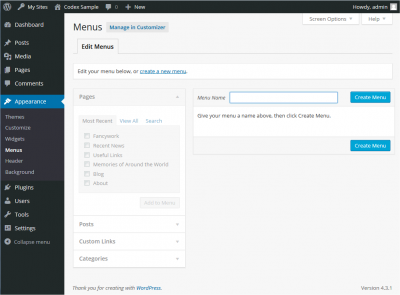
- Login to the WordPress Dashboard.
- From the ‘Appearance’ menu on the left-hand side of the Dashboard, select the ‘Menus’ option to bring up the Menu Editor.
- Select Create a new menu at the top of the page
- Enter a name for your new menu in the Menu Name box
- Click the Create Menu button.
Your new custom menu has now been defined.
Adding Items to a Menu
You can add different link types into your menu, these are split between panes left of the menu you’re currently editing.
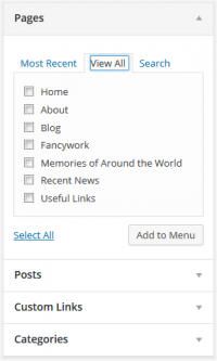
- Locate the pane entitled Pages.
- Within this pane, select the View All link to bring up a list of all the currently published Pages on your site.
- Select the Pages that you want to add by clicking the checkbox next to each Page’s title.
- Click the Add to Menu button located at the bottom of this pane to add your selection(s) to the menu that you created in the previous step.
- Click the Save Menu button once you’ve added all the menu items you want.
Your custom menu has now been saved.
Note The Screen Options allow you to choose which items you can use to add to a menu. Certain items, like Tags are hidden by default.
Deleting a Menu Item
- Locate the menu item that you want to remove in the menu editor window
- Click on the arrow icon in the top right-hand corner of the menu item/box to expand it.
- Click on the Remove link. The menu item/box will be immediately removed.
- Click the Save Menu button to save your changes.
Customizing Menu Items
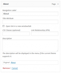
- Navigation Label
- This field specifies the title of the item on your custom menu. This is what your visitors will see when they visit your site/blog.
- Original
- A link to the original source of the menu item (e.g. a link to view the post or page).
Following items are hidden by default. Use Screen Options to show the required fields.
- Title Attribute
- This field specifies the Alternative (‘Alt’) text for the menu item. This text will be displayed when a user’s mouse hovers over a menu item.
- Link Target
- Select “Same window or tab” or “New window or tab” from the pulldown.
- CSS Classes
- Optional CSS Classes for this menu item
- Link Relationship (XFN)
- Allows for the generation of XFN attributes automatically so you can show how you are related to the authors/owners of site to which you are linking. See Link Relationship for details.
- Description
- Description for this link. The description will be displayed in the menu if the current theme supports it.
- Click on the arrow in the top right-hand corner of the menu item to expand it.
- Enter the values for the required fields that you want to assign to the item.
- Click the Save Menu button to save your changes.
Creating Multi-level Menus
When planning the structure of your menu, it helps to think of each menu item as a heading in a formal report document. In a formal report, main section headings (Level 1 headings) are the nearest to the left of the page; sub-section headings (Level 2 headings) are indented slightly further to the right; any other subordinate headings (Level 3, 4, etc) within the same section are indented even further to the right.
The WordPress menu editor allows you to create multi-level menus using a simple ‘drag and drop’ interface. Drag menu items up or down to change their order of appearance in the menu. Drag menu items left or right in order to create sub-levels within your menu.
To make one menu item a subordinate of another, you need to position the ‘child’ underneath its ‘parent’ and then drag it slightly to the right.
- Position the mouse over the ‘child’ menu item.
- Whilst holding the left mouse button, drag it to the right.
- Release the mouse button.
- Repeat these steps for each sub-menu item.
- Click the Save Menu button in the Menu Editor to save your changes.
Knowledge-based
How to setup email address with GMAIL account
To setup cooperate email account with your GMAIL account is the best way to manage your cooperate email. Below are the simple steps for your
Theme Style – Global Settings
Theme Style – Global Settings Theme Style settings are global settings that allow you to set default styling options for various elements, such as Backgrounds, Headings, Buttons, Images, and Form Fields. These
How to Customize Your WooCommerce Product Page Template Visually & Fonts
How to Customize Your WooCommerce Product Page Template Visually & Fonts. Learn how to visually customize your WooCommerce product page templates using Elementor. Do you

Good news for online seller! Design your own website now from our nice templates.
Woa – Now everyone can own a site! Start your online store with WOASITE templates. For online sellers, you may have a look on below

How to get affiliate link?
How to get affiliate link? First you have to join us as affiliate thru affiliate registration form [here] or join us as Reseller Master or

Did a mistake? Revision History, Undo and Redo
Don’t worry to try and edit your website, you will always protected by revision history. Login to your website thru: yourdomain/wp-admin. You will able to
Any other queries ? Click our live-chat below and chat with us...
Our Livechat working hour:
10am to 6pm.
(MONDAY to FRIDAY)

